Lighting Cabinet, Multi-channel LED, Daylight & Blackbody Simulator, Image Evaluation, Camera Calibration, Visual Assessment
A Practical Guide for Color Managers- THE SECOND C: COLOR WITH A PURPOSE (Part 2)
Color Inspiration at a Design-Driven Brand
According to Yun Chen, choosing colors is like exploring a “lonely, uncharted wilderness.” [5] It is up to a designer’s talent and vision to select a collection of colors to represent the aesthetic of a design concept. Some designers see new colors clearly in their mind’s eye and need a way to document them. Others go exploring in stores, galleries. This textile series will share technical insights and wisdom of AATCC members. The "Second C" series will focus on color. If you wish to contribute your own technical insights on topics of interest to AATCC members, contact Communications Director, Maria Thiry; Technical Insight or anyplace likely to spark their imagination. They don’t know what they want, but they’ll “know it when they see it.” [6]
In either case, color designers must rely on “found objects” to represent the colors that they want. This is no mean feat, since it is estimated that there are between 1.5 and 2 million distinguishable colors that can be represented on textiles. [7] Found objects fall into two classes: 1) color reference sets and 2) colors artifacts (also known as cuttings, swatches, etc.). [8] Color reference sets are large collections of colors (usually between 2,000 and 5,000 colors) marketed to support various segments within the design industry. They are set up on different substrates such as paper, plastic, or fabric, sometimes intended for use in specific processes like printed packaging. Some companies market the breadth of their collections while others claim to have the “right” colors, not the most colors.
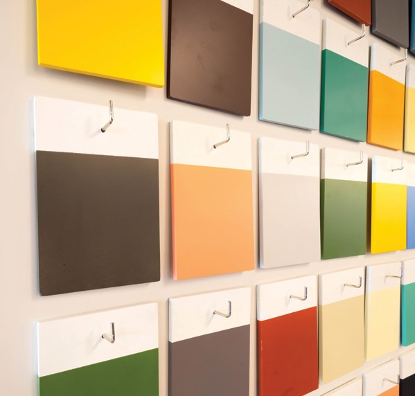
Colorists at Design-driven brands point out three aesthetic weaknesses of color reference sets: first, everyone has access to them. A designer who wants an exclusive, “new” color is unlikely to look in a source marketed to the masses. Similarly, color reference sets are colors selected by someone else. Although color reference sets are sold as an aid to color selection, some see them as a crutch. And finally, there are never enough colors in a color reference set. If it has 5,000, then sure enough, it needs 5,001 to meet a particular designer’s need.
And then there are color artifacts—the cuttings that are the size of one’s fingernail and the bane of a dyer’s existence. The use of fabric cuttings continues to this day. Just like a betrothed at Filene’s "Running of the Brides," searching for the perfect color involves the thrill of the hunt. One may have to dig deep to find the right swatch, but that is part of the exclusivity of the process.
Color Inspiration at a Merch-Driven Brand
If Design-driven color inspiration is taking Frost’s “road less traveled,” then the Merch-driven color inspiration process is traveling Interstate 5 from the San Bernardino Freeway to the San Gabriel River Freeway at 5:00pm—and loving it. Merch-driven colorists want to know the colors that are selling now. They look to trend reports and fashion hot spots around the world for information. In this sense, they are closely aligned with “Fast Fashion” in their effort to jump on the color bandwagon driven by someone else.
Some trend services claim to use AI technology to scrape color information from thousands of key fashion-related websites and provide up-to-the-minute, focused color forecasts. The validity of the color data used in this process may be subject to question, but the demand for such insight cannot be doubted. To streamline the process, color trend services link their forecasts to commercial color reference sets.

Merch-driven brands are much more likely to rely on color reference sets and forbid the use of cuttings as color references. In a sense, trend research can be like an echo chamber. Every garment that is included in a trend analysis was designed at least a year prior. And its design may have been based on trend research including garments produced another year back. So, in essence, a Merch-driven approach to fashion just keeps drinking its own spit.
Regardless of the motivation, the colors selected to populate a color palette must be handed off for replication. As we move from the sacred to the profane (in a theological sense), the big question is whether or not color inspirations can be feasibly matched on Technical Insight the intended materials. Indeed, color standards must be feasible in order to meet the purpose of color management—“assuring that the product ends up in the right color.” In the next installment, we’ll talk about this hand-off—and even integration—between color inspiration and replication.
References:
[5.] Chen, Yun & Yu, Luwen & Westland, Stephen & Cheung, Vien. (2021). “Investigation of Designers’ Colour Selection Process,” Colour Research & Application. 46. 10.1002/col.22631.
[6.] Not unlike how Justice Potter Stewart described his ability to spot pornography— “I’ll know it when I see it,” Jacobellis v. Ohio, 378 U.S.184, 197 (1964)
[7.] Judd, D.B. and Wyszecki, G. (1975), Color in Business, Science, and Industry, John Wiley and Sons.
[Reproduction Notice] This series of articles is published with the permission of the author, Keith Hoover, and has been edited and adapted. Any reproduction must clearly indicate the source and include relevant links.
Most People like
-
 PMCC- The Future of Colour Rendition 10568
 -
 A Practical Guide for Color Managers- THE SECOND C: COLOR WITH A PURPOSE (Part 1) 7811
 -
 A Practical Guide for Color Managers- THE SECOND C: COLOR WITH A PURPOSE (Part 2) 6669
 -
 What You See is What You Get! Introducing LEDSimulator: The Total Appearance Color Communication Platform 6000
 -
 Precision in Color Management: How RAL Standards and CMF Design Influence Industrial Color? 5604
 -
 Preserving Light and Shadow: How Spectrally Tunable LEDs Safeguard Global Art and Cultural Heritage 2300
 -
 How Cameras “See True Color” — Exploring the Critical Role of Multi-Channel LED Calibration Light Sources in Camera Production Lines 2082
Random Article
- 2025-10-09 How Cameras “See True Color” — Exploring the Critical Role of Multi-Channel LED Calibration Light Sources in Camera Production LinesWhy Do Cameras “See Colors Wrong”? Have you ever noticed that two cameras capture the same scene with noticeably different colors? One of the main reasons lies in the light source used during production and testing. A camera’s “eyes” — its image sensors — are highly sensitive to light. If the spectral power distribution (SPD) of the test light source is unstable, the camera may misinterpret colors or brightness. That’s why controllable, spectrally stable light sources are essential in both camera production lines and laboratories. Among these, multi-channel spectrally tunable LED light sources are increasingly adopted by manufacturers and research…
- 2023-09-15 PMCC- The Future of Colour RenditionAbstract A colour rendition chart, named Preferred Memory Colour Chart (PMCC), has been produced. It includes 30 colours, diving into three groups: preferred memory colours, reference colour gamut and a grey sale. The methods to derive these colours and the colour specification of each colour were covered. Its applications were also introduced. 1.Introduction XRite ColorChecker chart (XCCC) [1], which has been widely used in imaging industry for five decades, as a colour reproduction target. It has been widely used to build colour correction metric for cameras under different illuminants, to check the fidelity against the image on displays. The chart…
- 2022-08-06 A Practical Guide for Color Managers- THE SECOND C: COLOR WITH A PURPOSE (Part 2)Color Inspiration at a Design-Driven Brand According to Yun Chen, choosing colors is like exploring a “lonely, uncharted wilderness.” [5] It is up to a designer’s talent and vision to select a collection of colors to represent the aesthetic of a design concept. Some designers see new colors clearly in their mind’s eye and need a way to document them. Others go exploring in stores, galleries. This textile series will share technical insights and wisdom of AATCC members. The "Second C" series will focus on color. If you wish to contribute your own technical insights on topics of interest to AATCC…
- 2025-02-10 Precision in Color Management: How RAL Standards and CMF Design Influence Industrial Color?In the World of Color, Precision Matters More Than You Think! From smartphones and automobiles to architecture, home appliances, and medical equipment, color, material, and finish (CMF) design plays a crucial role in shaping our visual experiences. In industrial manufacturing, ensuring color consistency and stability is essential, as it directly impacts brand identity, product quality, and consumer purchasing decisions. But did you know? The same color can appear drastically different under different lighting conditions! This is why color standardization and precise control are critical in industrial design, brand marketing, and manufacturing processes. This necessity is at the heart of both…
- 2022-07-05 What You See is What You Get! Introducing LEDSimulator: The Total Appearance Color Communication PlatformUnlike traditional color communication methods, LEDSimulator offers a real-time, error-free total appearance color management system. It enables instant reproduction of colors, textures, and translucency, ensuring consistency, speed, and accuracy in color communication across the global supply chain between designers, brands, and manufacturers. This not only reduces communication costs significantly but also shortens the time-to-market for products. Through the LEDSimulator viewing window, designers, brand managers, and manufacturers can bypass time-consuming sample production and shipping. They can easily specify and verify fabrics’ color and texture in their full appearance, providing a seamless and efficient communication platform for color and texture matching. Since its…
- 2022-08-05 A Practical Guide for Color Managers- THE SECOND C: COLOR WITH A PURPOSE (Part 1)The American Association of Textile Chemists and Colorists (AATCC) is an industry advocacy group focusing on the effective application of color and functional finishes on textiles. Textiles are used in many sectors including transportation, military/government, industrial, medical/ healthcare, sports/fitness, and fashion, thus the business and end-use requirements vary widely. As we see rapid changes in global business, AATCC “continues to evolve to meet the needs of those in the ever-changing textile, apparel, and materials industries.” [1] The textile, apparel, and materials industries are huge. The global apparel retail market drives about US$1.8 trillion in revenue. [2] Textile mills and apparel…
- 2025-08-25 Preserving Light and Shadow: How Spectrally Tunable LEDs Safeguard Global Art and Cultural HeritageLight. Protection. Challenges. Light is the medium through which art is brought to life, but improper illumination can also become a potential threat to cultural heritage. Research indicates that organic pigments—particularly red and yellow—are highly susceptible to fading or degradation when exposed to inappropriate lighting conditions, with significant damage occurring in just a few months. To combat this, leading museums around the world are increasingly adopting spectrally tunable LED lighting technology. Not only does this technology offer outstanding energy efficiency, but it also represents a breakthrough in precise spectral control: effectively filtering out harmful UV/IR radiation, regulating blue light levels,…


