Lighting Cabinet, Multi-channel LED, Daylight & Blackbody Simulator, Image Evaluation, Camera Calibration, Visual Assessment

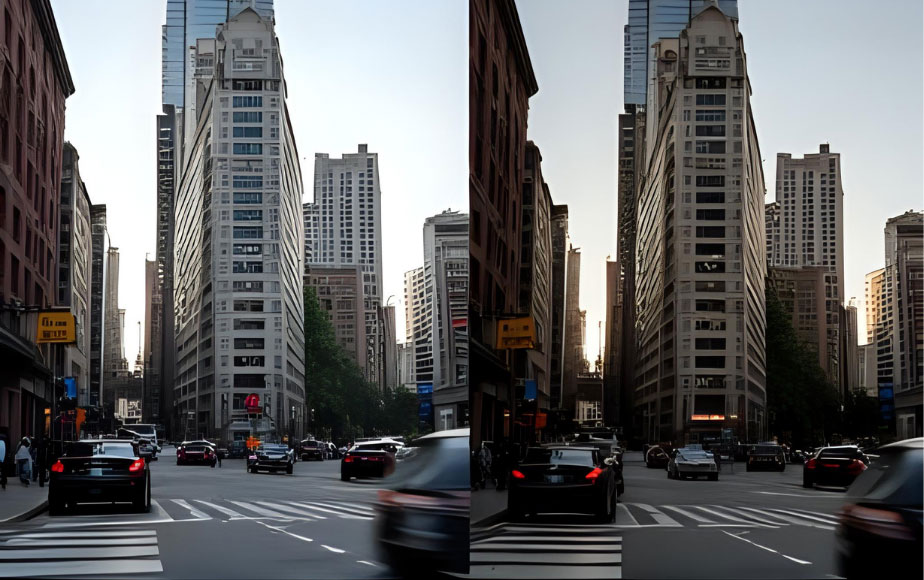 How Cameras “See True Color” — Exploring the Critical Role of Multi-Channel LED Calibration Light Sources in Camera Production LinesWhy Do Cameras “See Colors Wrong”? Have you ever noticed that two cameras capture the same scene with noticeably different colors? One of the main reasons lies in the light source used during production and testing. A camera’s “eyes” — its image sensors — are highly sensitive to light. If the spectral power distribution (SPD) of the test light source is unstable, the camera may misinterpret colors or brightness. That’s why controllable, spectrally stable light sources are essential in both camera production lines and laboratories. Among these, multi-channel spectrally tunable LED light sources are increasingly adopted by manufacturers and research institutions for their ability to accurately reproduce different spectra. ↑Two cameras capture the same scene with noticeably different colors. Light and Camera Calibration: A Battle Between “Reality” and “Deviation” To enable a camera to see true color, several key aspects must be standardized: 1.Spectral Power Distribution (SPD) The spectrum is the “fingerprint” of light, defining energy across different wavelengths. If the spectrum deviates, red may appear pink, and blue may turn violet. → Therefore, camera calibration must be performed under a known and controllable SPD. 2.Color Temperature and Color Rendering You may have noticed how photos look warmer under…2025-10-09
 Preserving Light and Shadow: How Spectrally Tunable LEDs Safeguard Global Art and Cultural HeritageLight. Protection. Challenges. Light is the medium through which art is brought to life, but improper illumination can also become a potential threat to cultural heritage. Research indicates that organic pigments—particularly red and yellow—are highly susceptible to fading or degradation when exposed to inappropriate lighting conditions, with significant damage occurring in just a few months. To combat this, leading museums around the world are increasingly adopting spectrally tunable LED lighting technology. Not only does this technology offer outstanding energy efficiency, but it also represents a breakthrough in precise spectral control: effectively filtering out harmful UV/IR radiation, regulating blue light levels, and delivering high CRI/R9, thereby creating a truly protective exhibition lighting environment. ↑Leading museums worldwide are gradually adopting spectrally tunable LED lighting technology to achieve a truly "protective exhibition" lighting environment. The Science Behind Spectral Control: Why It Matters The essence of cultural heritage lighting lies in balancing visual authenticity with minimal damage—a task that depends entirely on the precise regulation of the spectral power distribution (SPD): ● CRI & R9: Pigments such as crimson red or hemp yellow require high color fidelity. To ensure that artworks display rich, vibrant colors, international museums typically require a CRI ≥ 90…2025-08-25
 Precision in Color Management: How RAL Standards and CMF Design Influence Industrial Color?In the World of Color, Precision Matters More Than You Think! From smartphones and automobiles to architecture, home appliances, and medical equipment, color, material, and finish (CMF) design plays a crucial role in shaping our visual experiences. In industrial manufacturing, ensuring color consistency and stability is essential, as it directly impacts brand identity, product quality, and consumer purchasing decisions. But did you know? The same color can appear drastically different under different lighting conditions! This is why color standardization and precise control are critical in industrial design, brand marketing, and manufacturing processes. This necessity is at the heart of both RAL color standards and CMF design principles. As globally renowned color scientist Professor Ronnier Luo famously stated, "In our industry, color is everything." This statement is not just a motto for designers but a fundamental truth for all professionals involved in color management. How can we ensure that colors remain accurate and consistent across different lighting environments? A perfectly matched color in the lab might look completely different under store lighting, daylight, or office illumination, potentially leading to inconsistencies in product appearance and market perception. Addressing this challenge is the driving force behind advancements in color science—and the key topic…2025-02-10
 PMCC- The Future of Colour RenditionAbstract A colour rendition chart, named Preferred Memory Colour Chart (PMCC), has been produced. It includes 30 colours, diving into three groups: preferred memory colours, reference colour gamut and a grey sale. The methods to derive these colours and the colour specification of each colour were covered. Its applications were also introduced. 1.Introduction XRite ColorChecker chart (XCCC) [1], which has been widely used in imaging industry for five decades, as a colour reproduction target. It has been widely used to build colour correction metric for cameras under different illuminants, to check the fidelity against the image on displays. The chart has been widely used for evaluating cameras’ quality in terms of colour accuracy, white balance, tonal response, noise or signal to noise ratio (SNR), etc. It also includes some memory colours, by reproducing the measurement results of some familiar objects. It can be concluded it has been widely used to achieve successful colour reproduction. However, it has been realised that users are more appreciate pleasing images rather than accurate images. Hence, Hunt [2] differentiate the fidelity against preferred colour reproductions. Preferred Memory Colour Chart (PMCC) as shown in Fig. 1 was intended to provide a tool for evaluating the device…2023-09-15
 A Practical Guide for Color Managers- THE SECOND C: COLOR WITH A PURPOSE (Part 2)Color Inspiration at a Design-Driven Brand According to Yun Chen, choosing colors is like exploring a “lonely, uncharted wilderness.” [5] It is up to a designer’s talent and vision to select a collection of colors to represent the aesthetic of a design concept. Some designers see new colors clearly in their mind’s eye and need a way to document them. Others go exploring in stores, galleries. This textile series will share technical insights and wisdom of AATCC members. The "Second C" series will focus on color. If you wish to contribute your own technical insights on topics of interest to AATCC members, contact Communications Director, Maria Thiry; Technical Insight or anyplace likely to spark their imagination. They don’t know what they want, but they’ll “know it when they see it.” [6] In either case, color designers must rely on “found objects” to represent the colors that they want. This is no mean feat, since it is estimated that there are between 1.5 and 2 million distinguishable colors that can be represented on textiles. [7] Found objects fall into two classes: 1) color reference sets and 2) colors artifacts (also known as cuttings, swatches, etc.). [8] Color reference sets are large collections…2022-08-06
 A Practical Guide for Color Managers- THE SECOND C: COLOR WITH A PURPOSE (Part 1)The American Association of Textile Chemists and Colorists (AATCC) is an industry advocacy group focusing on the effective application of color and functional finishes on textiles. Textiles are used in many sectors including transportation, military/government, industrial, medical/ healthcare, sports/fitness, and fashion, thus the business and end-use requirements vary widely. As we see rapid changes in global business, AATCC “continues to evolve to meet the needs of those in the ever-changing textile, apparel, and materials industries.” [1] The textile, apparel, and materials industries are huge. The global apparel retail market drives about US$1.8 trillion in revenue. [2] Textile mills and apparel factories create another US$1.9 trillion in global revenue. [3] And these numbers grow every year. The “Second C” in AATCC is for Colorists. This series of articles will deal with color in the apparel industry, focusing primarily on apparel brands, since that is where color specifications start. Additionally, we will see how practices emanating from brand color offices impact mills and garment factories. The Purpose of the Second C The Second C is a practical guide to assist colorists. The intention is not to present novel academic research or use big words. Rather, over the coming year, I will discuss…2022-08-05
Most People like
-
 PMCC- The Future of Colour Rendition 10348
 -
 A Practical Guide for Color Managers- THE SECOND C: COLOR WITH A PURPOSE (Part 1) 7637
 -
 A Practical Guide for Color Managers- THE SECOND C: COLOR WITH A PURPOSE (Part 2) 6527
 -
 What You See is What You Get! Introducing LEDSimulator: The Total Appearance Color Communication Platform 5882
 -
 Precision in Color Management: How RAL Standards and CMF Design Influence Industrial Color? 5404
 -
 Preserving Light and Shadow: How Spectrally Tunable LEDs Safeguard Global Art and Cultural Heritage 2186
 -
 How Cameras “See True Color” — Exploring the Critical Role of Multi-Channel LED Calibration Light Sources in Camera Production Lines 1876
Random Article
- 2025-02-10 Precision in Color Management: How RAL Standards and CMF Design Influence Industrial Color?In the World of Color, Precision Matters More Than You Think! From smartphones and automobiles to architecture, home appliances, and medical equipment, color, material, and finish (CMF) design plays a crucial role in shaping our visual experiences. In industrial manufacturing, ensuring color consistency and stability is essential, as it directly impacts brand identity, product quality, and consumer purchasing decisions. But did you know? The same color can appear drastically different under different lighting conditions! This is why color standardization and precise control are critical in industrial design, brand marketing, and manufacturing processes. This necessity is at the heart of both…
- 2022-08-05 A Practical Guide for Color Managers- THE SECOND C: COLOR WITH A PURPOSE (Part 1)The American Association of Textile Chemists and Colorists (AATCC) is an industry advocacy group focusing on the effective application of color and functional finishes on textiles. Textiles are used in many sectors including transportation, military/government, industrial, medical/ healthcare, sports/fitness, and fashion, thus the business and end-use requirements vary widely. As we see rapid changes in global business, AATCC “continues to evolve to meet the needs of those in the ever-changing textile, apparel, and materials industries.” [1] The textile, apparel, and materials industries are huge. The global apparel retail market drives about US$1.8 trillion in revenue. [2] Textile mills and apparel…
- 2023-09-15 PMCC- The Future of Colour RenditionAbstract A colour rendition chart, named Preferred Memory Colour Chart (PMCC), has been produced. It includes 30 colours, diving into three groups: preferred memory colours, reference colour gamut and a grey sale. The methods to derive these colours and the colour specification of each colour were covered. Its applications were also introduced. 1.Introduction XRite ColorChecker chart (XCCC) [1], which has been widely used in imaging industry for five decades, as a colour reproduction target. It has been widely used to build colour correction metric for cameras under different illuminants, to check the fidelity against the image on displays. The chart…
- 2025-10-09 How Cameras “See True Color” — Exploring the Critical Role of Multi-Channel LED Calibration Light Sources in Camera Production LinesWhy Do Cameras “See Colors Wrong”? Have you ever noticed that two cameras capture the same scene with noticeably different colors? One of the main reasons lies in the light source used during production and testing. A camera’s “eyes” — its image sensors — are highly sensitive to light. If the spectral power distribution (SPD) of the test light source is unstable, the camera may misinterpret colors or brightness. That’s why controllable, spectrally stable light sources are essential in both camera production lines and laboratories. Among these, multi-channel spectrally tunable LED light sources are increasingly adopted by manufacturers and research…
- 2022-07-05 What You See is What You Get! Introducing LEDSimulator: The Total Appearance Color Communication PlatformUnlike traditional color communication methods, LEDSimulator offers a real-time, error-free total appearance color management system. It enables instant reproduction of colors, textures, and translucency, ensuring consistency, speed, and accuracy in color communication across the global supply chain between designers, brands, and manufacturers. This not only reduces communication costs significantly but also shortens the time-to-market for products. Through the LEDSimulator viewing window, designers, brand managers, and manufacturers can bypass time-consuming sample production and shipping. They can easily specify and verify fabrics’ color and texture in their full appearance, providing a seamless and efficient communication platform for color and texture matching. Since its…
- 2025-08-25 Preserving Light and Shadow: How Spectrally Tunable LEDs Safeguard Global Art and Cultural HeritageLight. Protection. Challenges. Light is the medium through which art is brought to life, but improper illumination can also become a potential threat to cultural heritage. Research indicates that organic pigments—particularly red and yellow—are highly susceptible to fading or degradation when exposed to inappropriate lighting conditions, with significant damage occurring in just a few months. To combat this, leading museums around the world are increasingly adopting spectrally tunable LED lighting technology. Not only does this technology offer outstanding energy efficiency, but it also represents a breakthrough in precise spectral control: effectively filtering out harmful UV/IR radiation, regulating blue light levels,…
- 2022-08-06 A Practical Guide for Color Managers- THE SECOND C: COLOR WITH A PURPOSE (Part 2)Color Inspiration at a Design-Driven Brand According to Yun Chen, choosing colors is like exploring a “lonely, uncharted wilderness.” [5] It is up to a designer’s talent and vision to select a collection of colors to represent the aesthetic of a design concept. Some designers see new colors clearly in their mind’s eye and need a way to document them. Others go exploring in stores, galleries. This textile series will share technical insights and wisdom of AATCC members. The "Second C" series will focus on color. If you wish to contribute your own technical insights on topics of interest to AATCC…